UI Tips
UX Tips
Articles
Newsletter
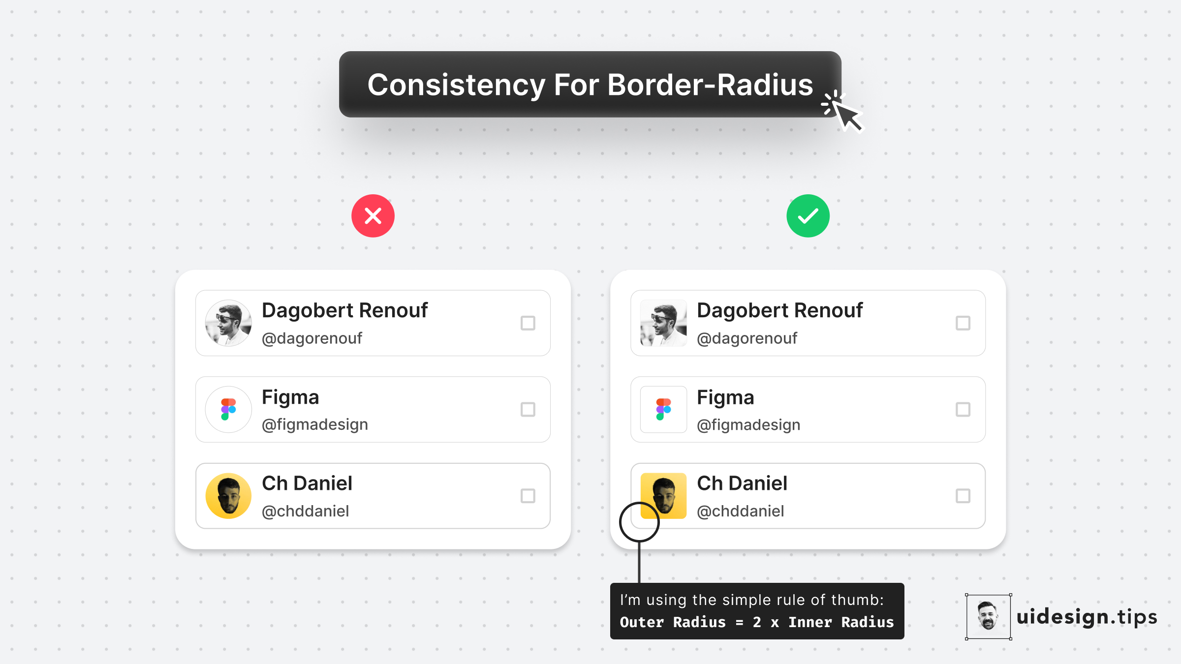
Round images usually look weird when they're included in a card with a small border-radius. Use the simple rule of thumb: ššŖš©šš§ šššššŖšØ = 2 * šš£š£šš§ šššššŖšØ * The precise formula is more complicated since you need to take into account the spacing between the two borders, so let's it simple!
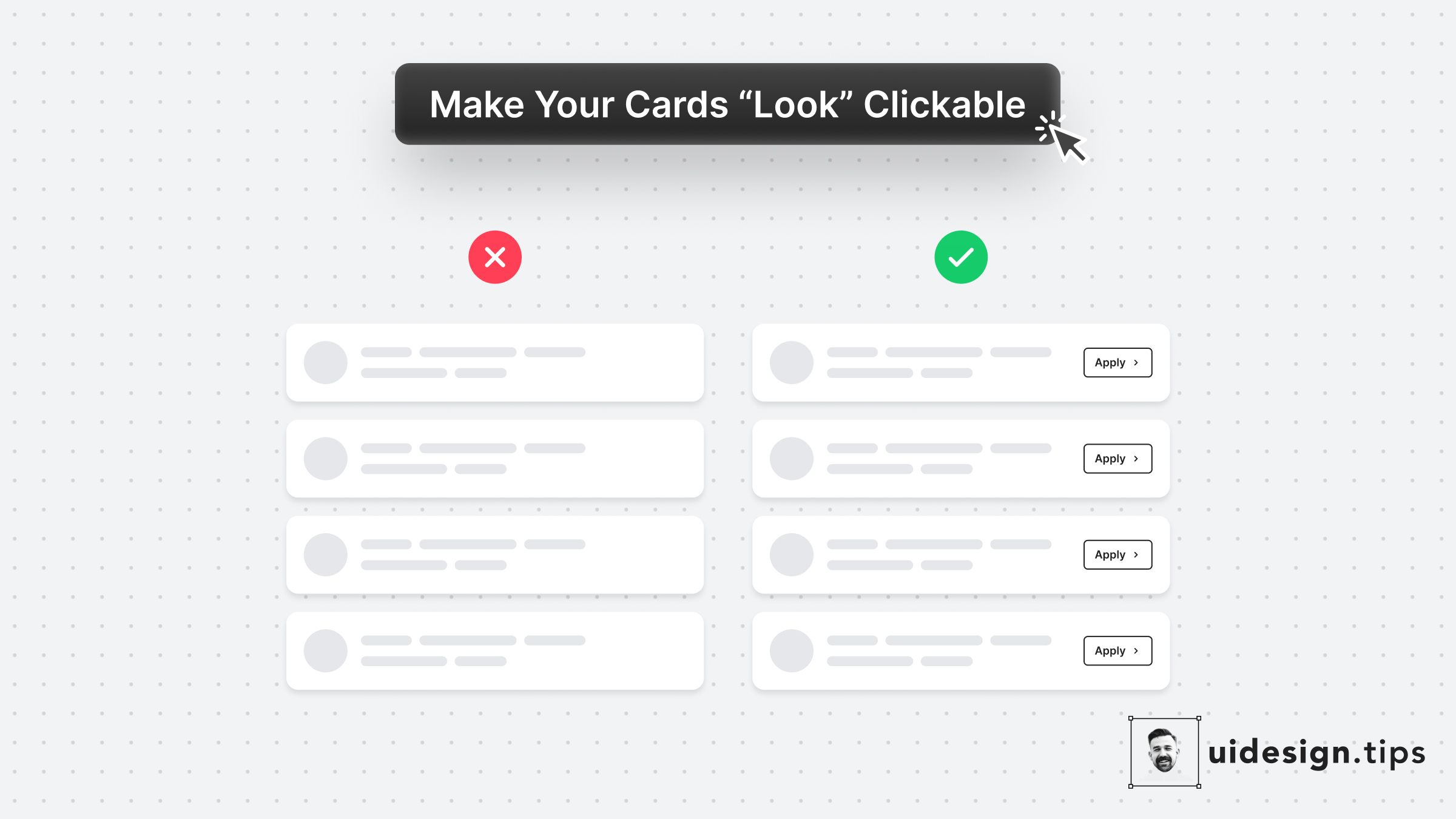
In many cases, cards fail to indicate that they're clickable. Designers omit CTA buttons and only count on the user's experience or/and, hover effects. **In design, it's always a good practice to never leave things on user imagination.** Instead use an actionable button to prompt clickability and describe the action.

The left cards use the same padding around the card. Yet the visual result seems off. A quick fix is to make the padding larger when the element on the edge is not round - like icons and text. The rule of thumb is to use **double the padding** on the edge which is not round.