UI Tips
UX Tips
Articles
Newsletter
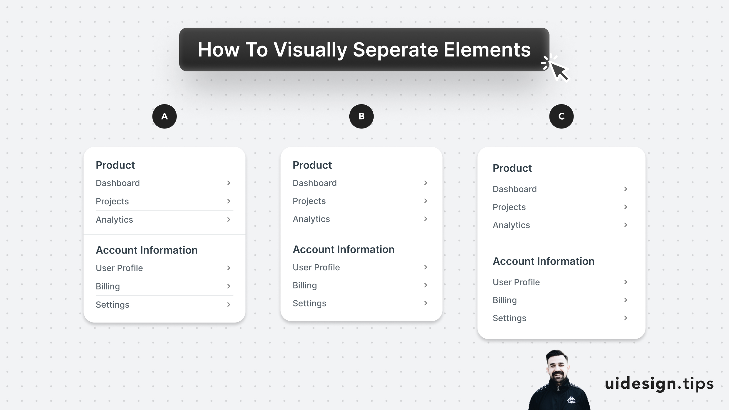
Prefer to visually separate menu sections with whitespace. Whitespace makes the UI look cleaner and request less cognitive effort from the user. In the example below: - A uses dividers for everything - B uses a divider between sections - C uses only whitespace A is too complex and distracts the user, but both B & C can be used on real-life user interfaces. B puts more attention on differentiating the sections. C makes the UI look cleaner.