
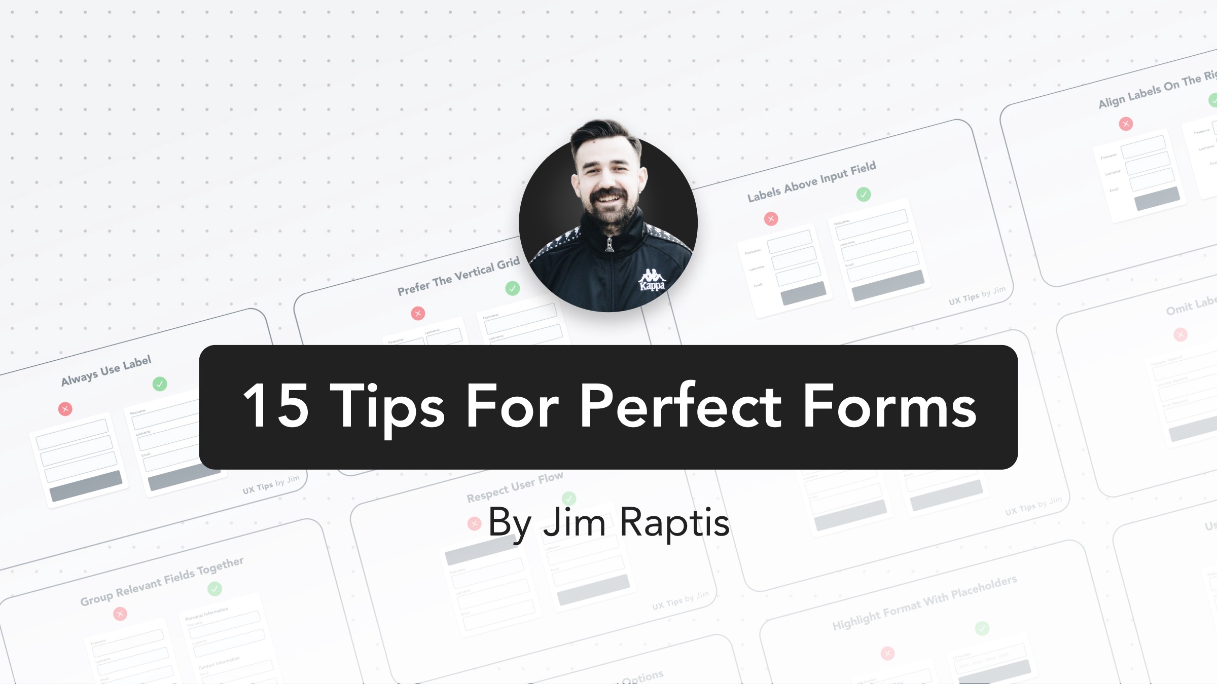
15 UI Tips for Better Forms
Design better UI forms with these 15 practical tips and avoid the most common UI mistakes that will cost you conversions
Written by Jim Raptis
June 17, 2021
Forms are an integral part of any UI. They establish an asynchronous communication channel between businesses and users. Their importance is undoubtful, but there’re still many examples around the web of poorly made forms with disastrous mistakes. A bad form can destroy your conversions, annoy users, or break your funnels.
That’s why I want to share these 15 practical tips to teach you how to build usable forms that respect the end-user & boost your conversion Let’s dive in! 👇
01. Always Use Labels
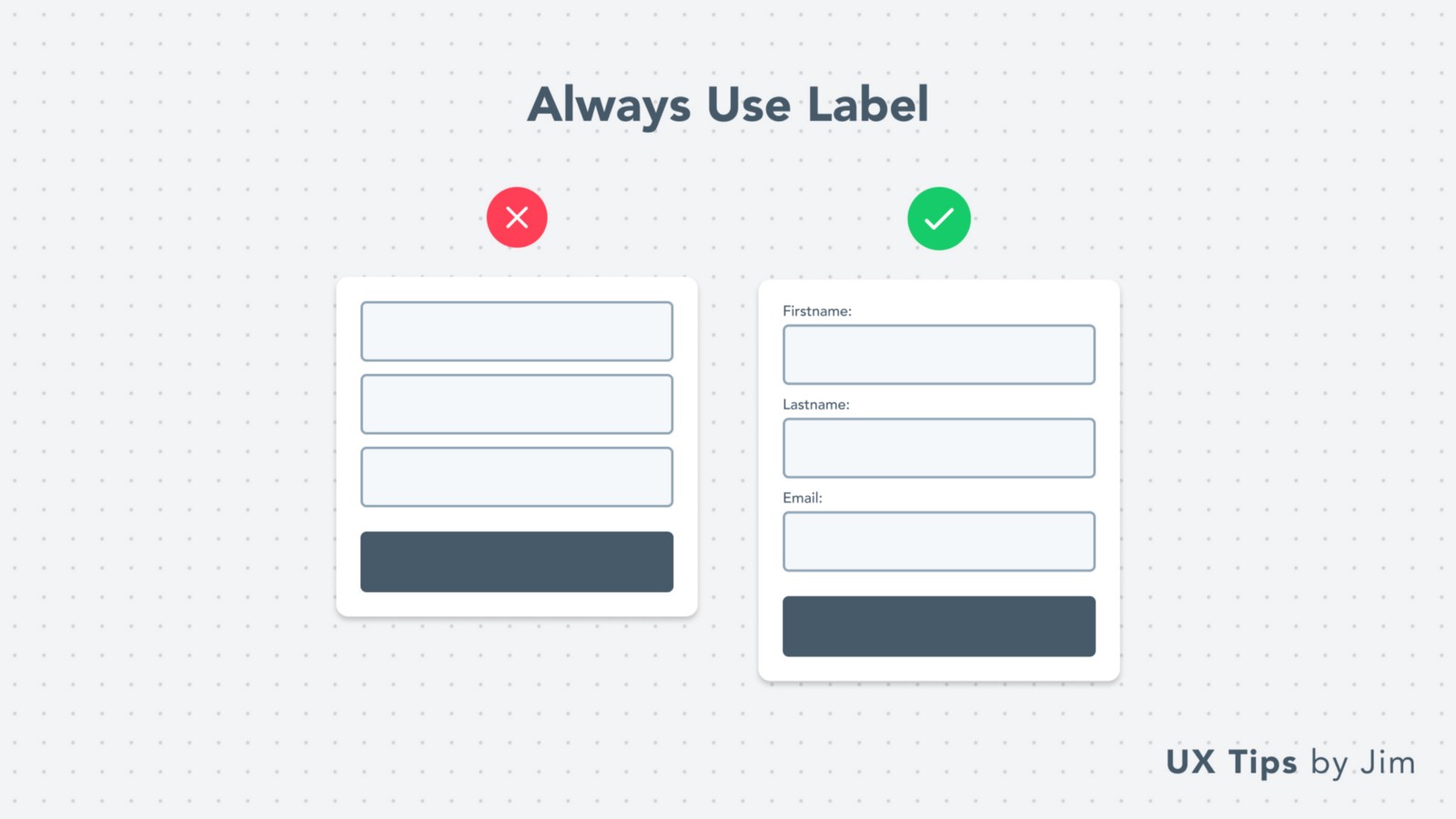 Labels are very important for your forms! It’s critical to include labels and keep them visible all the time. Nothing is more annoying than guessing what an input field is about.
In many cases, designers hide labels when the input fields are completed. But this causes confusion to users who can’t validate their input with ease.
Labels are very important for your forms! It’s critical to include labels and keep them visible all the time. Nothing is more annoying than guessing what an input field is about.
In many cases, designers hide labels when the input fields are completed. But this causes confusion to users who can’t validate their input with ease.
02. Avoid “Z-Pattern”
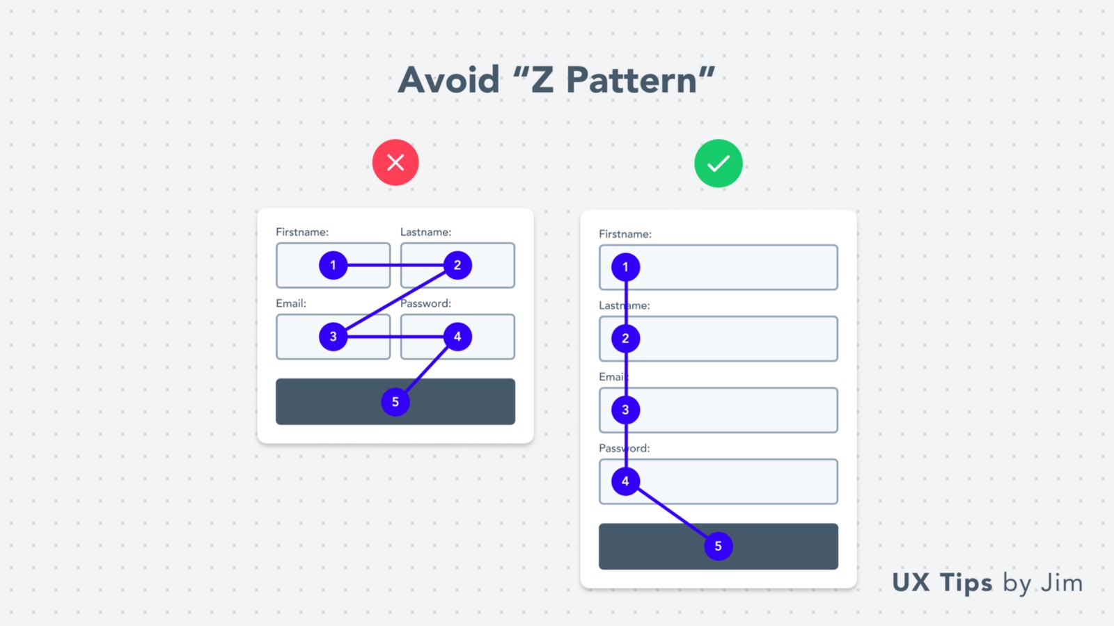 When you place your fields in a grid you force the user to follow the Z-Pattern which is not desirable because it might confuse them.
Z-Pattern
When the form fields are in a vertical line, the users scan the form with a quick vertical look and it’s easier for them to complete their task (fill the form).
When you place your fields in a grid you force the user to follow the Z-Pattern which is not desirable because it might confuse them.
Z-Pattern
When the form fields are in a vertical line, the users scan the form with a quick vertical look and it’s easier for them to complete their task (fill the form).
03. Place Labels Above Fields
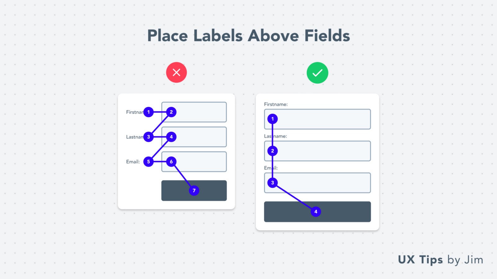 As an extension to the previous tip, labels placed on the left of the input field create a similar Z-Pattern that leads to a less scannable form.
Prefer to put your labels above the form fields to help users scan your form with ease.
If your form is very quick (less than 1–2 fields), it might not make a significant difference to place the labels on the left of the fields.
As an extension to the previous tip, labels placed on the left of the input field create a similar Z-Pattern that leads to a less scannable form.
Prefer to put your labels above the form fields to help users scan your form with ease.
If your form is very quick (less than 1–2 fields), it might not make a significant difference to place the labels on the left of the fields.
04. Use Right-Aligned Labels
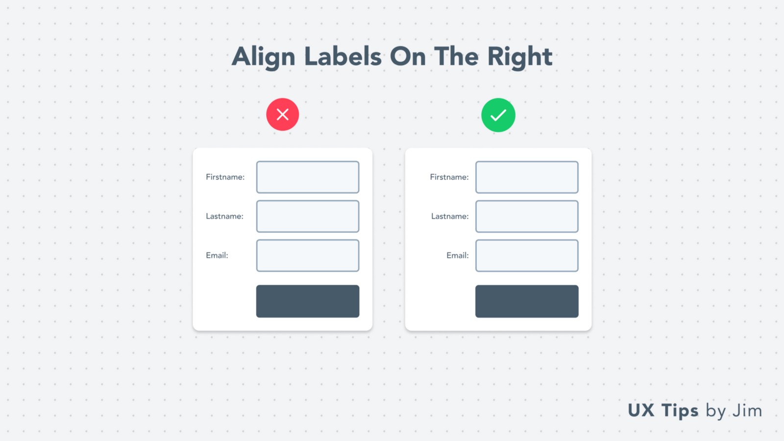 If you end up using labels on the left of the form, make sure the labels’ text is right-aligned.
This makes it easier for users to scan the page and creates a symmetric visual hierarchy for your form.
If you end up using labels on the left of the form, make sure the labels’ text is right-aligned.
This makes it easier for users to scan the page and creates a symmetric visual hierarchy for your form.
05. Group Relevant Fields Together
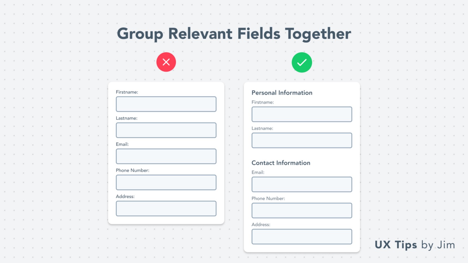 Long forms discourage users from filling them, which leads to lower conversions for you or your company.
A quick visual hack to make them more appealing (and less tiring) is to group relevant fields together in sub-sections.
To boost usability, even more, you can place a CTA “Save” button in each sub-section to allow users to save their input separately.
Long forms discourage users from filling them, which leads to lower conversions for you or your company.
A quick visual hack to make them more appealing (and less tiring) is to group relevant fields together in sub-sections.
To boost usability, even more, you can place a CTA “Save” button in each sub-section to allow users to save their input separately.
06. Respect User Flow
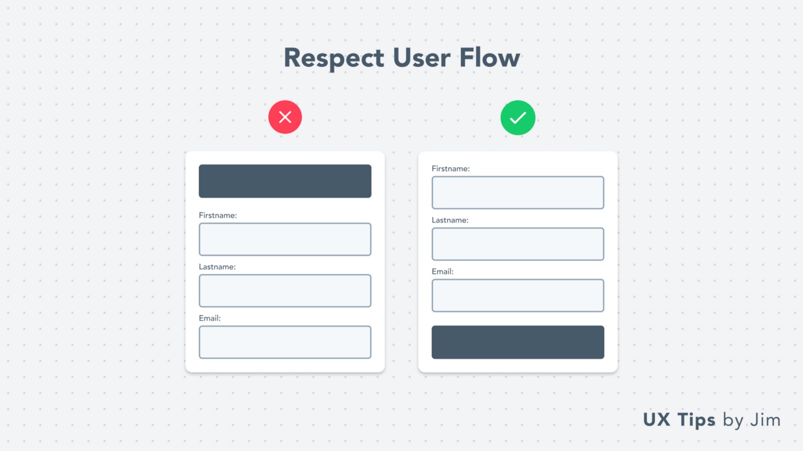 When users fill in a form, they complete each field one after the other, and then they expect to submit the form. This is their typical user flow.
Respect this user flow and place your CTA button near the form’s end.
This is a characteristic example of applying Fitts’s law in UI & UX design.
The time to acquire a target is a function of the distance to and size of the target.
When users fill in a form, they complete each field one after the other, and then they expect to submit the form. This is their typical user flow.
Respect this user flow and place your CTA button near the form’s end.
This is a characteristic example of applying Fitts’s law in UI & UX design.
The time to acquire a target is a function of the distance to and size of the target.
07. Give Space
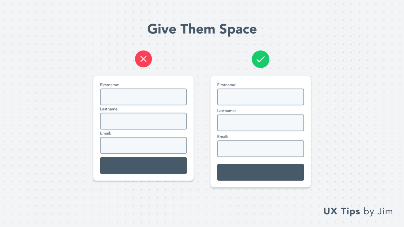 White-space is always your best design buddy!
Leave enough space between fields to make your form more aesthetically pleasing. Most users will avoid engaging with a too dense form.
White-space is always your best design buddy!
Leave enough space between fields to make your form more aesthetically pleasing. Most users will avoid engaging with a too dense form.
08. Avoid Label Repetition
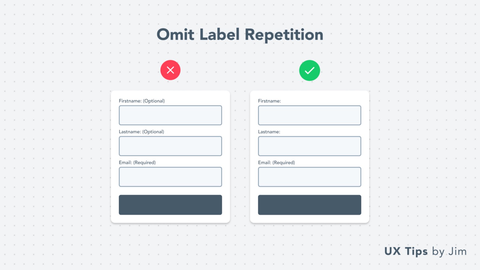 In design, we always avoid repeating the same information and/or data.
For forms specifically, you need to be careful and omit unnecessary information about the field. For example:
If you have 3 required fields and 1 optional. Notify the user about the optional field ONLY.
If you have 3 optional fields and 1 required. Do the opposite!
In design, we always avoid repeating the same information and/or data.
For forms specifically, you need to be careful and omit unnecessary information about the field. For example:
If you have 3 required fields and 1 optional. Notify the user about the optional field ONLY.
If you have 3 optional fields and 1 required. Do the opposite!
09. Descriptive Error Messages
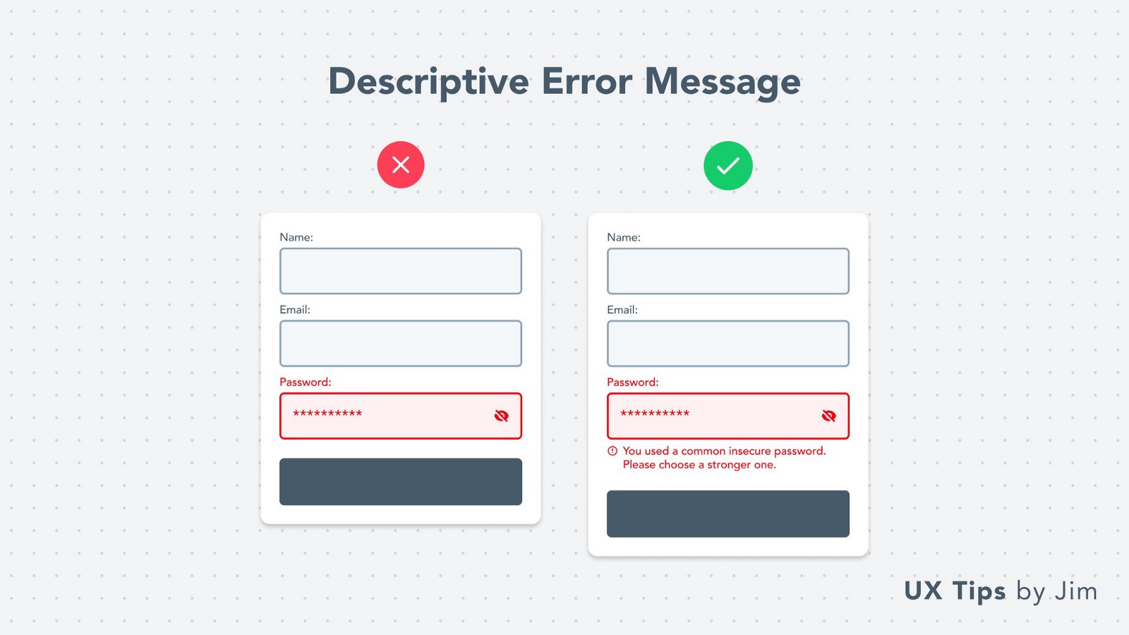 Errors happen! It’s common and users know that.
But they expect to understand why the error is there & how they can fix it.
Always describe the error’s source with in-depth details and help people overcome them.
Errors happen! It’s common and users know that.
But they expect to understand why the error is there & how they can fix it.
Always describe the error’s source with in-depth details and help people overcome them.
10. Use Dropdown When They’re Necessary
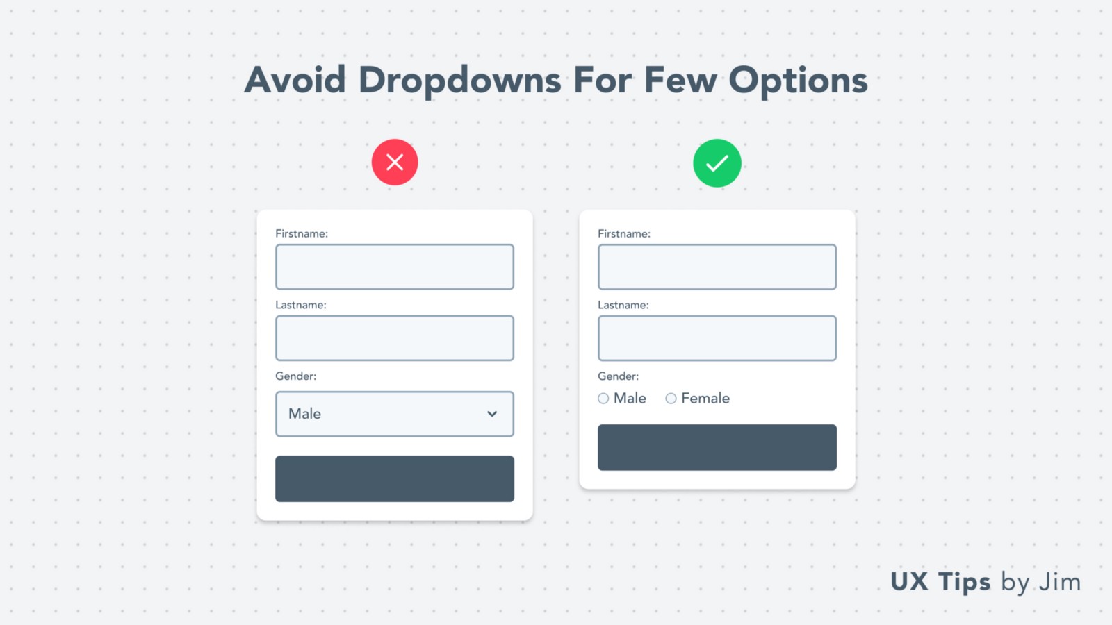 Choosing the right UI element for your form fields is critical!
Sometimes it’s might be unclear which element to choose. Especially when you‘re between dropdown and radio buttons
A common rule-of-thumb is to use a dropdown when you have more than 3 options.
For fewer options, go with radio buttons that allow users to see all the options in advance.
Choosing the right UI element for your form fields is critical!
Sometimes it’s might be unclear which element to choose. Especially when you‘re between dropdown and radio buttons
A common rule-of-thumb is to use a dropdown when you have more than 3 options.
For fewer options, go with radio buttons that allow users to see all the options in advance.
11. Leverage Placeholders
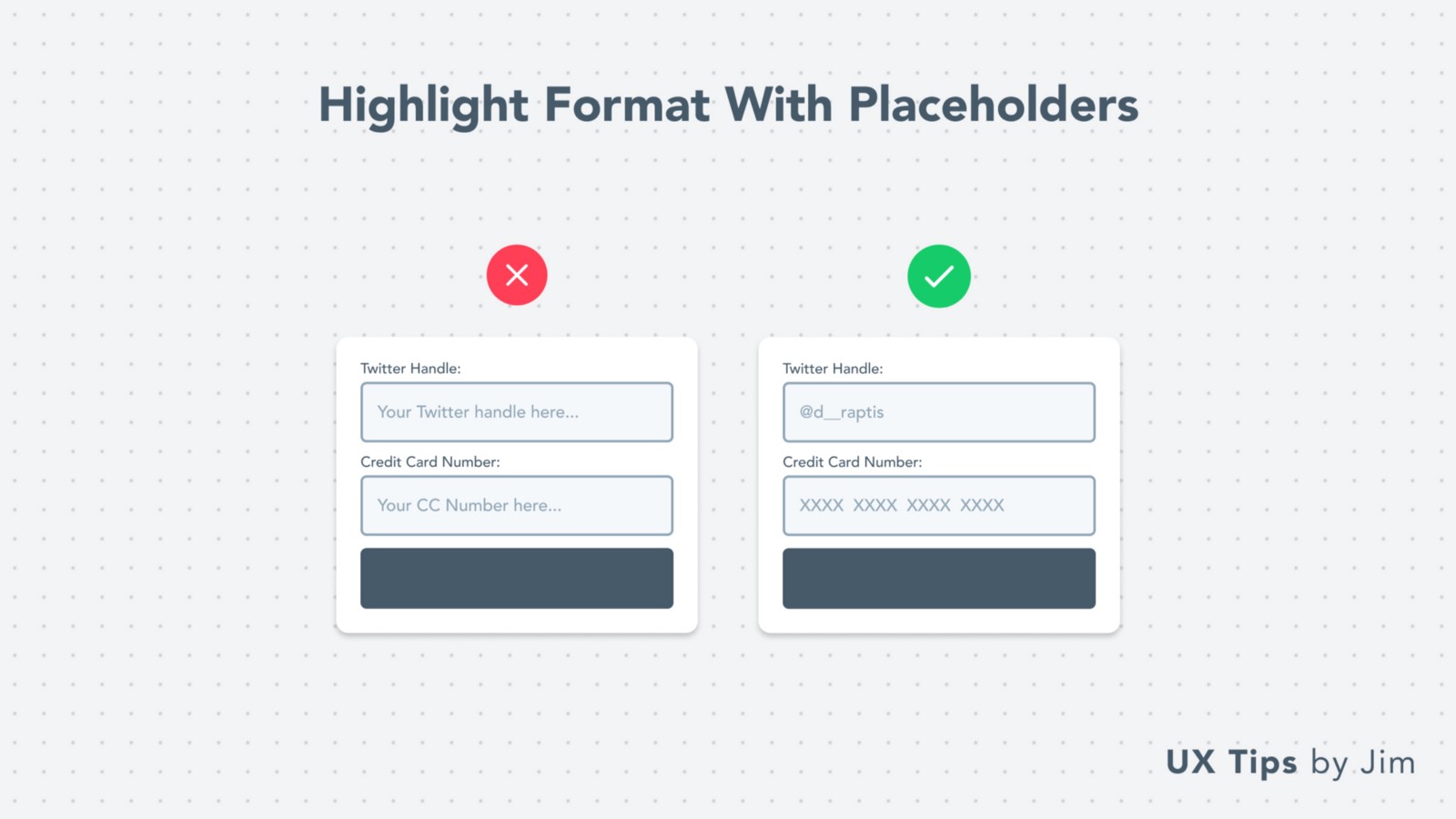 Placeholder text is a great way to guide people in a form.
Show an example value to demonstrate to them what’s the expected format for the field. Generic placeholder texts, don’t add any kind of value to the end-user.
Placeholder text is a great way to guide people in a form.
Show an example value to demonstrate to them what’s the expected format for the field. Generic placeholder texts, don’t add any kind of value to the end-user.
12. Use A Single CTA
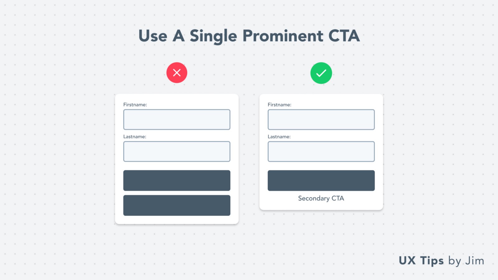 Don’t overwhelm users with multiple CTA buttons!
Keep it simple and use a single CTA.
If you need more CTA buttons, always try to incorporate them as secondary buttons. Less prominent than your main CTA.
Don’t overwhelm users with multiple CTA buttons!
Keep it simple and use a single CTA.
If you need more CTA buttons, always try to incorporate them as secondary buttons. Less prominent than your main CTA.
13. Actionable CTA Copy
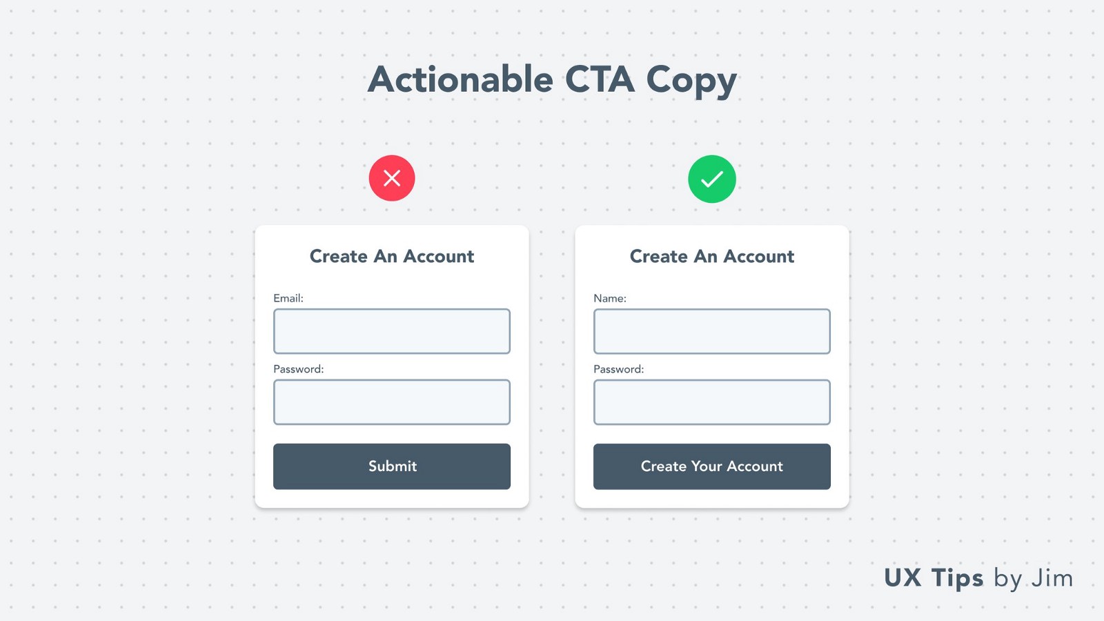 Copywriting can do wonders in design & usability.
For your form submit buttons avoid using words like submit, send, next, go.
Use actionable words that highlight the upcoming action. Some examples:
Copywriting can do wonders in design & usability.
For your form submit buttons avoid using words like submit, send, next, go.
Use actionable words that highlight the upcoming action. Some examples:
- For a signup form: “Create Your Account”
- For a waitlist form: “Join 1000+ Developers”
- For a feedback form: “Send Us Your Feedback”
14. Choose The Right Input Type
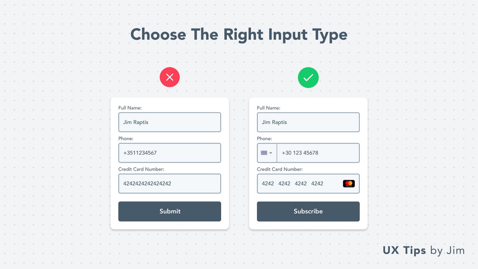 Don’t use text fields for everything!
Adapt the fields’ type to their content. There’re many content types that have specific requirements and need special treatment.
Some examples:
Don’t use text fields for everything!
Adapt the fields’ type to their content. There’re many content types that have specific requirements and need special treatment.
Some examples:
- Phone number
- Credit Cards
- Website URLs
- Countries
- Dates
- Colors
15. Highlight Limitations
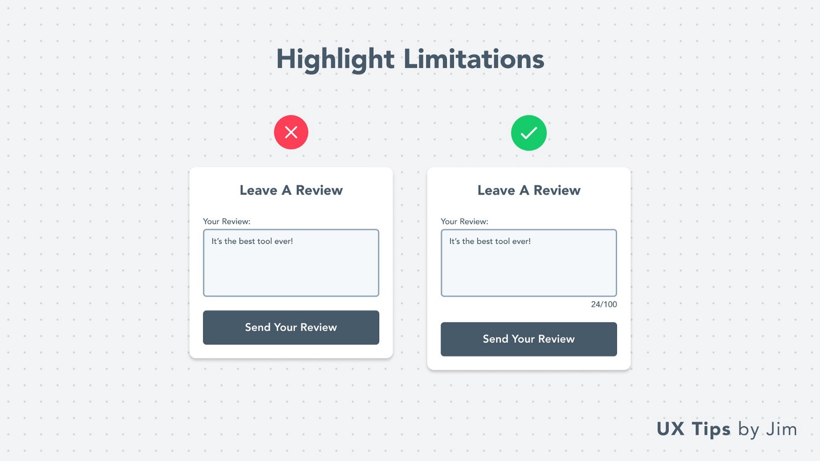 Most fields have some kind of limitation. Character limit, number/date range, phone number, etc.
Make users aware of limitations beforehand to prevent their frustration.
That’s all for now folks!
Most fields have some kind of limitation. Character limit, number/date range, phone number, etc.
Make users aware of limitations beforehand to prevent their frustration.
That’s all for now folks!
Hope you learned something new today, or I’ve reminded you of some good design practices.
👉 I’m posting similar visual UI & UX tips on Twitter daily and I have a
Really excited to have you on board & help you become a better designer ❤️
Become a Better Designer.
The Fun way.
Join 100s of developers, entrepreneurs & junior designers who strive to become better in UI & UX design with byte-sized, practical tips & examples!
Get notified about new tips & articles before anyone else!
"
I love these little tips. It’s like Dribbble but actually useful.
Martin LeBlanc
CEO of Iconfinder
"
I love UX & UI tips. Especially, when they are practical and presented in a very good way. Yours are meeting both criteria.
Lisa Dziuba
Head of Marketing at Abstract