
RECOMMENDED
All Tips
How to Apply the Brand Color
color
ui
visual effect
hierarchy
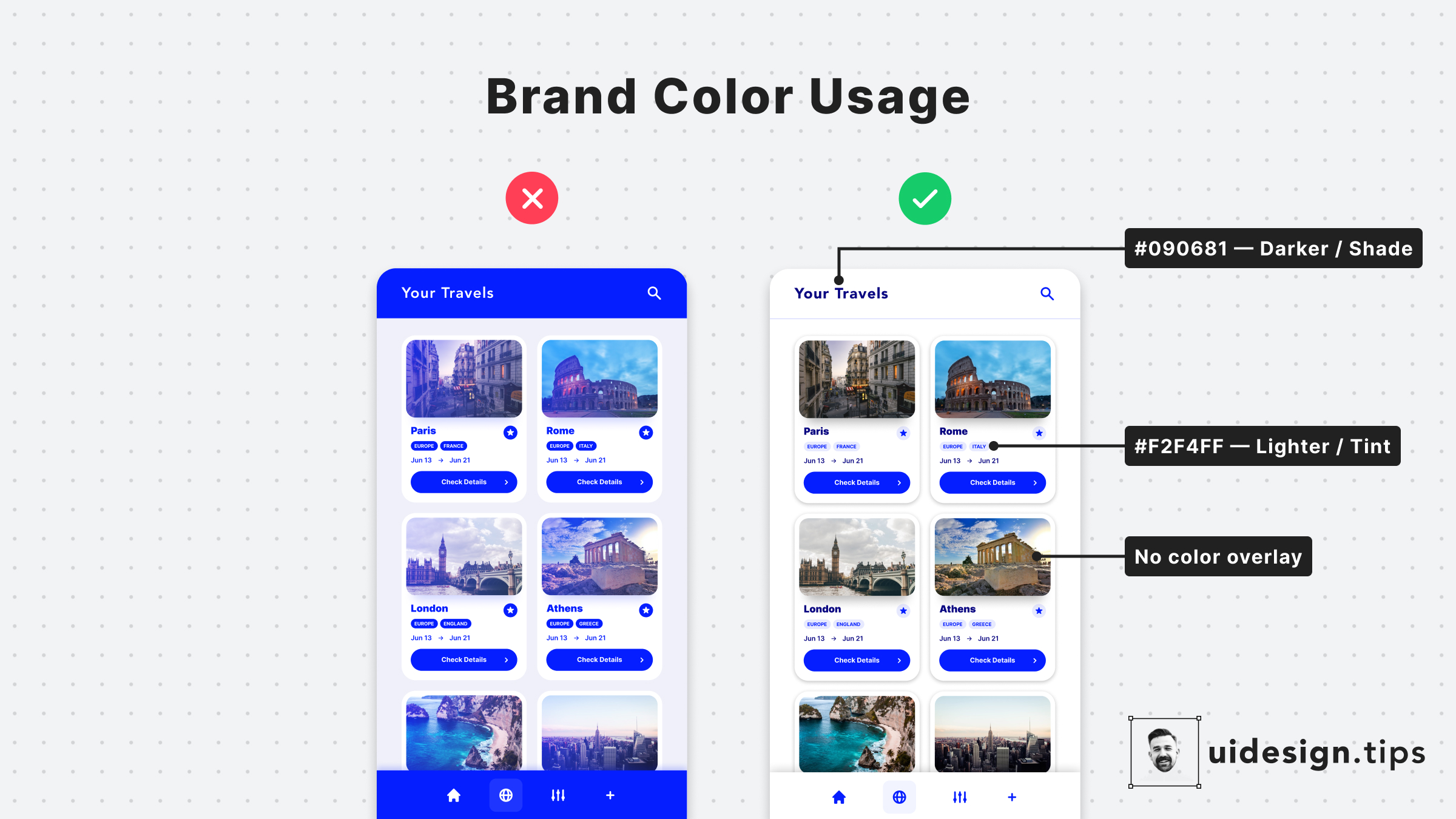
Colors are a core element for any user interface.
One of the most common mistakes in UI design is the over usage of the brand color.
Avoid it by highlighting only the most important elements of your interface with your primary color.
For the rest of the elements, combine tints & shades of your main color.
Become a Better Designer.
The Fun way.
Join 100s of developers, entrepreneurs & junior designers who strive to become better in UI & UX design with byte-sized, practical tips & examples!
Get notified about new tips & articles before anyone else!
"
I love these little tips. It’s like Dribbble but actually useful.
Martin LeBlanc
CEO of Iconfinder
"
I love UX & UI tips. Especially, when they are practical and presented in a very good way. Yours are meeting both criteria.
Lisa Dziuba
Head of Marketing at Abstract