
Jotform Rebrand Analysis
Jotform rebranded successfully their brand identity after 15 years. Learn how they manage to communicate their new vision with basic design hacks.
Written by Jim Raptis
October 8, 2021
Jotform is a form builder made by Aytekin Tank 15 years ago.
They are 100% bootstrapped with 10 million users and 350+ employees worldwide.
This week they announced their fresh brand that is their biggest change in 15 years.
Let's dive into their rebrand and learn how they did it 👇
🐦 Read Short Twitter Thread Instead
Typography
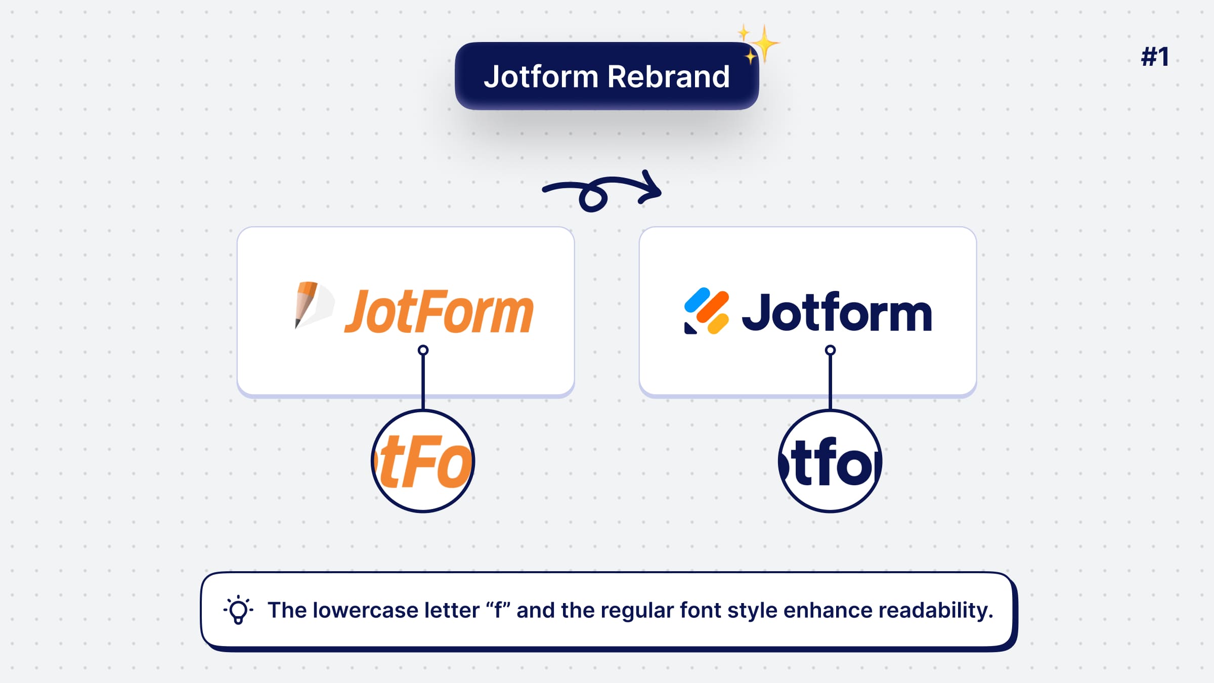
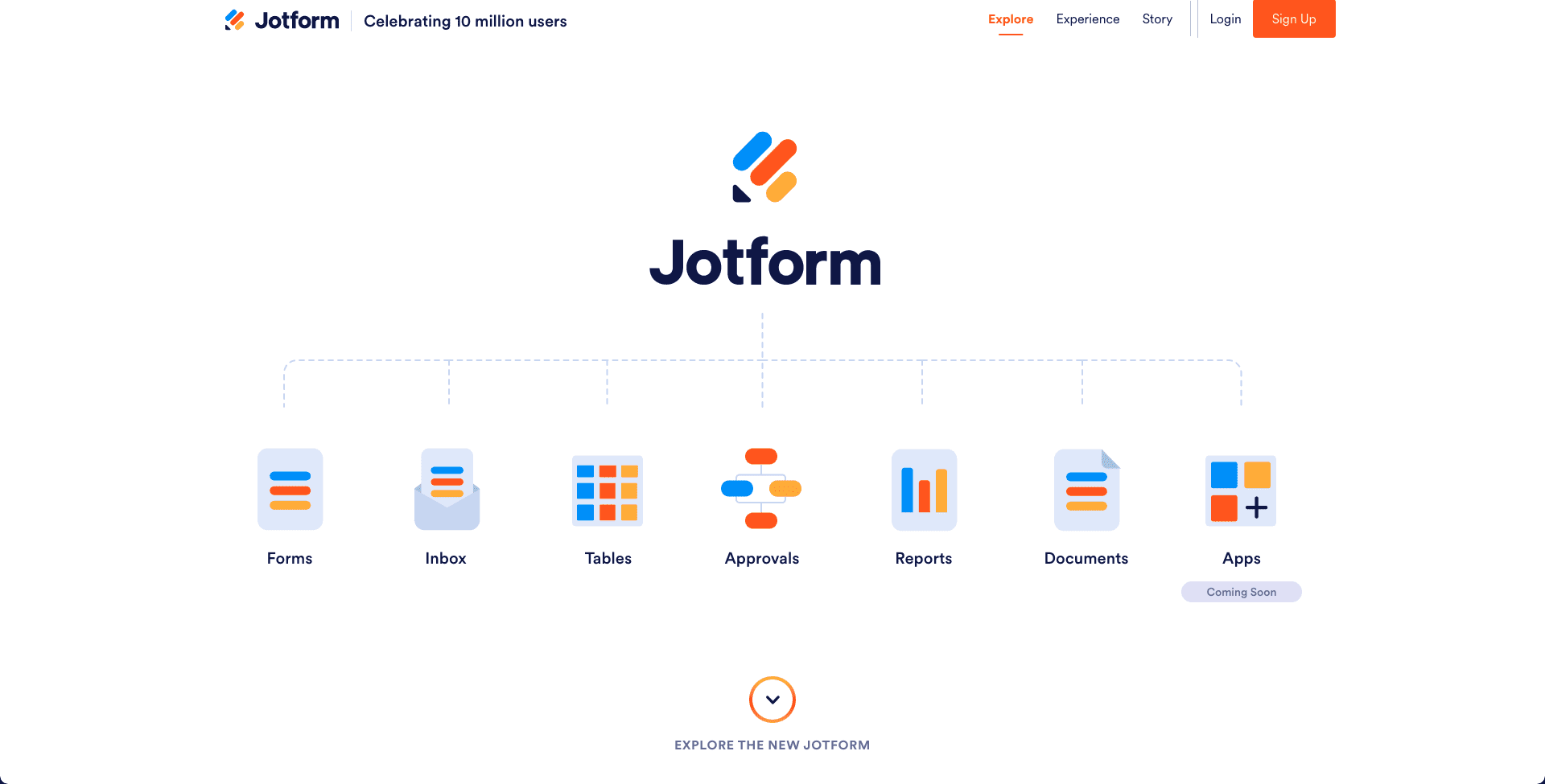
Jotform introduced a new way to write their name!
Now, the letter "f" is lowercase to promote readability.
A quote from "A study of the readability of on-screen text" by Eric Michael Weisenmiller that explain this better:
Lowercase letters have a more distinctive shape than capital letters, therefore they can be perceived more quickly than uppercase letters. Because readers are frequently exposed to a word, they no longer have to "read" the word, but instantly recognize the meaning by the familiar shape of the group of letters.
Also, the new Geometric Sans font gives an extra elegant and modern look to the name!
Iconography
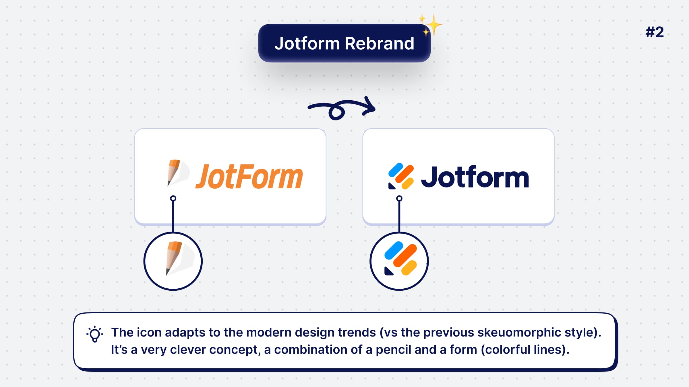
The old company's logo is influenced by skeuomorphism, which was a design trend a decade earlier when Jotform was founded.
That's why it needed a radical change.
The new icon incorporates nicely a modern style with a genius double meaning...
It's a pencil, but the colorful lines shape a tilted form, which is their core feature! 🤯
A perfect way to keep some trait from their old logo and adapt it to the new design era.
Tagline
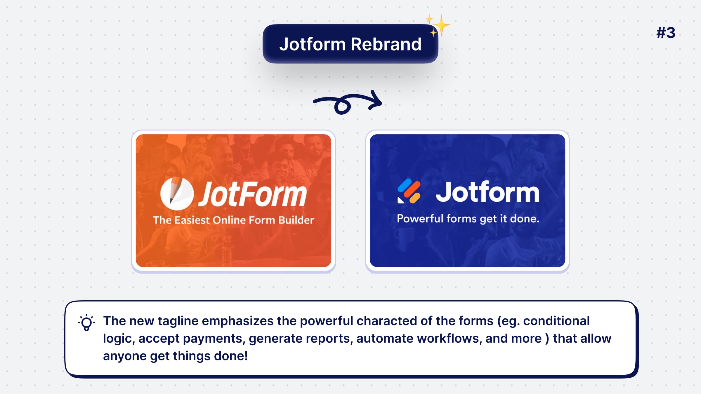
The old tagline used to promote the simplicity of the product.
However, the product evolved from a simple form editor to a powerful one through the years.
That's why the new messaging communicate the powerful character of Jotform:
- Conditional logic
- Accept payments
- Generate reports
- Automate workflows, and more.
Other Jotform Products
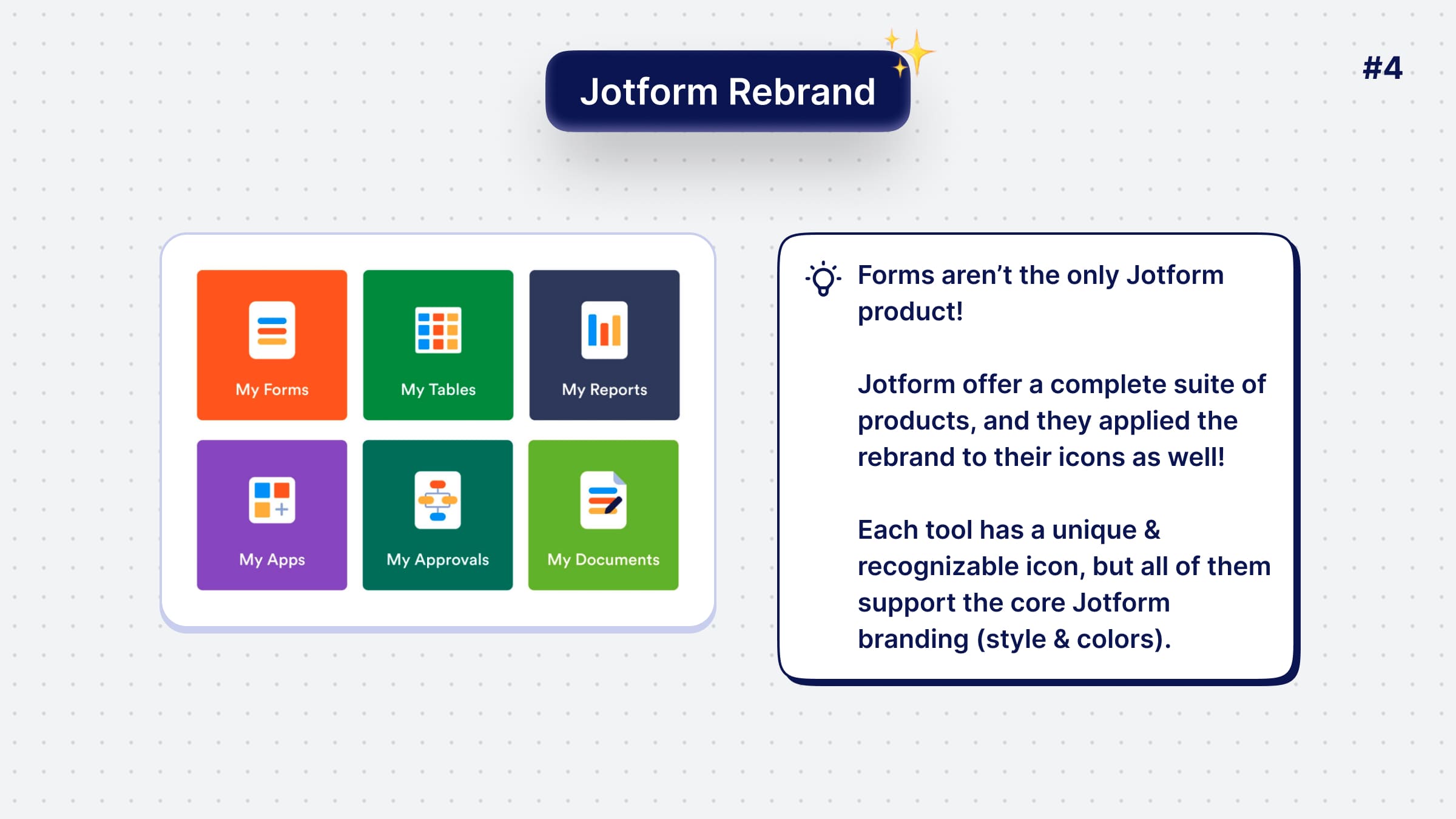
The form-builder is not the only Jotform product!
Jotform is a suite of products, and they had to rebrand them as well.
Each of the new icons supports the core Jotform branding (colors, style, etc.) that makes them recognizable as part of the group.
This technique is inspired by Google who redesigned all of the Google suite icons lately.
Conclusion
In conclusion, the Jotform team did a bold move with the rebrand!
Rebranding a 15yo product is always a tedius process & can confuse existing customers.
However, they manage to communicate their new vision perfectly and introduce a fresh brand identity.
If you want to learn more about their rebrand, process, and story, have a look at this link. 🔥
Hope you learned something new today, or I’ve reminded you of some good design practices.
👉 I’m posting similar visual UI & UX tips on Twitter daily and I have a
Really excited to have you on board & help you become a better designer ❤️
Become a Better Designer.
The Fun way.
Join 100s of developers, entrepreneurs & junior designers who strive to become better in UI & UX design with byte-sized, practical tips & examples!
Get notified about new tips & articles before anyone else!
"
I love these little tips. It’s like Dribbble but actually useful.
Martin LeBlanc
CEO of Iconfinder
"
I love UX & UI tips. Especially, when they are practical and presented in a very good way. Yours are meeting both criteria.
Lisa Dziuba
Head of Marketing at Abstract